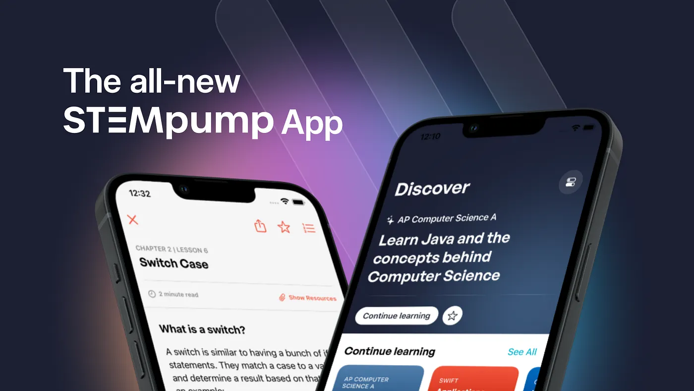
The Making of The all-new STEMpump App
How do we design and develop a new experience for students to learn? An introspection into the development of the all-new STEMpump app.
It's been, well, a while. I previously wrote this post, which briefly highlighted my journey of developing my first app, STEMpump. And while I planned to write more posts about the versions to follow, I didn't feel like there was enough to write about. As a result, I have a few semi-done drafts that might never see the light of day because nothing was that big of an improvement or innovation to write about.
If anything, this post indicates massive improvements and innovation since my first app. This post is a "brief" summarization of the theory, technology, and implementation that went into the latest STEMpump app, which might be a whole different thing. You can download the app for yourself here.
What is STEMpump?
Before we jump into the technojargon, you might not know what STEMpump is if you're new.
STEMpump is an educational organization dedicated to creating a global platform for contribution, collaboration, and expression. We aim to transform traditional education by offering a modernized teaching environment that gives students a medium to learn and contribute to our mission of free education for all.
As students, we create free, accessible educational technology and content for students, all of which are STEAM-based. (STEAM: Science, Technology, Engineering, Arts, and Math; yes, I know we're called STEMpump, not STEAMpump.)
We do everything in-house, from our visual media to our live streams, even our entire publishing backend. So I've learned about building industry-level technologies while working towards a fantastic cause — free education for all.
We've taught over 110K+ students from 110+ countries, and we're not stopping soon. Our mission statement is our goal, and this app is a stepping stone to that point.
Who are you?
My name is Ritesh Kanchi. I'm a high-schooler interested in Human-Computer Interaction, Social Impact, and Educational Technology.
I write about my experiences and thoughts on technology, art, and education. I also create cool things from time to time. You can follow me on Twitter or shoot me an email if you want to chat.
Anyways, let's jump right into it.
I've broken this post into two main sections, with a few subsections: Design and Development. I like to break up all my projects like this, as it gives me an individual focus at a time, so it only makes sense to write in the same standard.
Design
Content to Read from vs. Content to Learn from
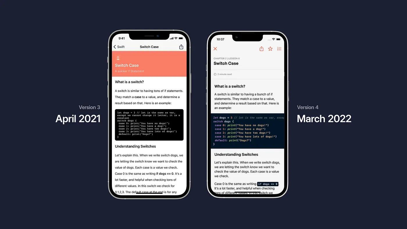
There's a big difference in how content is perceived. Whether it's a lesson, blog post, transcript, glossary, whatever, it's not something I mainly understood over the first three versions of this app.
See, it's easy to "randomly" stylize some content, throw it on a view/screen, and call it a day. It's effortless to do so — and for a good reason. In this context, we have Content to Read from. You read it, and you're done. In the real world, menus, instructions, and signs are forms of this. We're not meant to learn; we just choose and follow.
What's harder is creating Content to Learn from. How we display typography, blocked elements, etc., directly influences how we learn. Text isn't over or under stylized, but just enough so that we can remember it. This includes some modern textbooks, online documentation, and simple tutorials. Flashcards, unsurprisingly, also fall under this. (Have you found anyone who learns from terribly/overly designed flashcards? I didn't think so.)
Last summer, we updated our Typography styling on STEMpump.org when we shifted our whole platform to the JAMStack. Tailwind Typography is a great base, and we built on top of it to meet our needs.
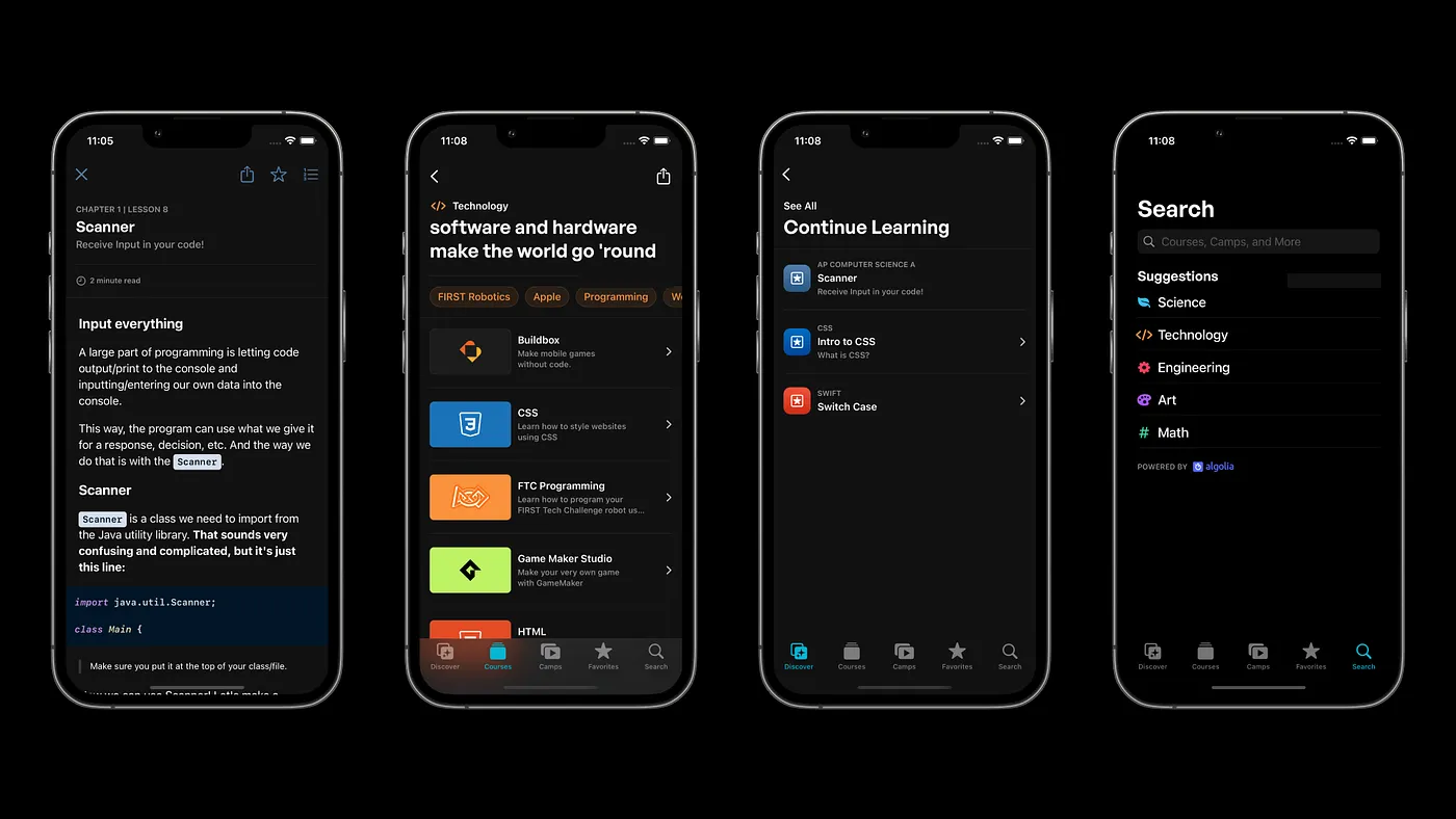
At STEMpump, we primarily write our content in Markdown, and for the app, we used Down, a "Blazing fast Markdown rendering system" to render it out with Swift.
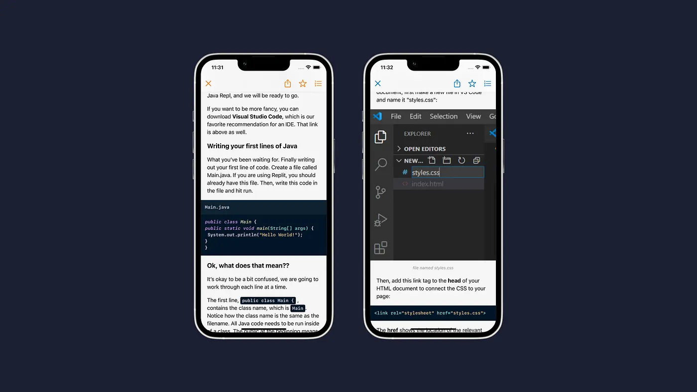
However, we were limited by Down and its inability to add new rules and extensions to the parsing system. To bring over features such as Syntax Highlighting, Syntax File Naming, and Image Alternative Text, I wrote a simpler Markdown parser that adds everything missing. It's high efficiency, meaning that Down can still be fast enough to render massive amounts of content in milliseconds.
Designing towards Accessibility: Universal Design
There's been a massive design trend with accessibility in mind in recent years. Not only being able to make products for all to use but provide the same experience.
I spent the Fall on a deep dive into Universal Design and accessibility. I've read opinions that said Universal Design just couldn't exist but also views that it exists everywhere.
Universal design is the design of buildings, products or environments to make them accessible to all people, regardless of age, disability or other factors.
With that in mind, it's an exciting idea: design for everyone? It seems impossible.
But here's my stance: "Yes, it's impossible-that doesn't mean we shouldn't try to make it possible." Everything is always impossible before its possible, isn't it? (i.e., space flight, the lightbulb, personal computing)
I also thought a bit about the idea of majority vs. minority design and have the conclusion:
“An interesting thing happens when we design for the minority first.
I believe when you design with the minority in mind, the majority will benefit. They benefit via the concept of universal design: design that is accessible to all people. So the real question is, how do we go about designing for the minority? How do we redefine technology with no significant group in mind?”
- Me, 2021
And there's a good reason I leave it open-ended: because the answer to this question changes on a person-by-person basis.
So when it comes to accessibility in this app, how did I approach it? Well, slow and steady wins the race, right? I had the opportunity in December to speak to Apple Engineers about accessibility in the V3 app, and the majority of suggestions they offered are now implemented in the app.
One of the big ones was that our Markdown content now scales with DynamicType, which didn't happen before. The app is now more linear for automatic accessibility functions to be much better than prior versions.
Accessibility in design remains our number one priority, and it won't leave that spot — we can always make technology more accessible. We can always make experiences more universal.
Defining a new, cross-platform Design System
Last summer, we moved our entire web platform to the JAMStack. This required a total rewrite from the ground up with React and Next.js. With TailwindCSS, we were given the power of a utility-first CSS framework to redefine what we wanted STEMpump to feel like.

We designed PacificUI 2, our in-house design system, as a conglomeration of modern design and our organization's past. As a result, our design sense was simplified and placed a stronger emphasis on learning.
So when it came time to develop the app, we had to redefine PacificUI to look just as good on both the web and mobile. The app has elements lifted directly from the site while maintaining its unique look. With a lot of the views in the app, I hope to bring the same level of design to the website, as are complementary experiences.
It's always been the case where the app's functionality surpasses the website, but as we continue developing both side by side, that gap seems to be decreasing to reach a 1:1 parity (almost.)
Making a new Dark Mode was an exciting challenge. I learned that pure black interfaces aren't always the best choice — but almost black interfaces are. They make things feel cleaner and make the experience feel almost bounded. We still use pure black in some places, but for the majority of the app, you'll get the "off-black."
Same with the Light Mode, we're using an "off-white," which presents the same feeling with the Dark Mode. And I think it comes down to imperfection. But it also is about bringing depth to our design, something we can do with these variants.
Layout/Responsive Hell
I'm going to be honest; I'm no Marie Kondo. So when it came to the layout and organization of this app, it was almost a nightmare for the first few iterations. As I write this, I redesigned the interface of courses yesterday — that's how unconfident I was in the old design.
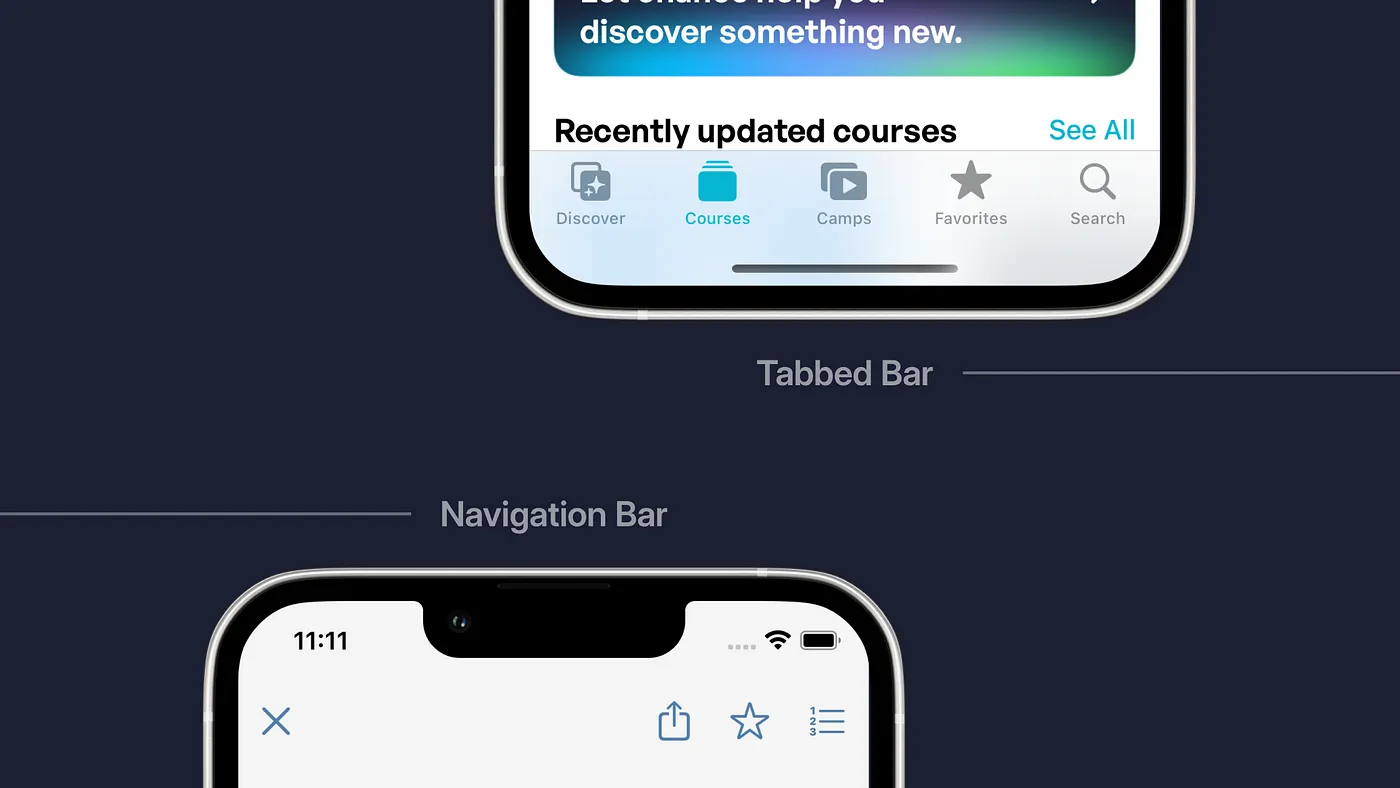
Being in a fixed space such as a phone is great! I love restrictions and rules in design because it forces me to "color inside the lines." More problem-solving is required to get everything to fit. We're now using a tabbed bar to divide the app into five views: Discover, Courses, Camps, Favorites, and Search. It makes things easier for the user and gives you fingers reach to everything.
I'm a sucker for something called The Thumb/Touch Zone. Essentially, the idea is that our hand is forced to stretch further across the screen proportionally to the size of our phones over time. (Remember the original iPhone? Now look at the iPhone 13 Pro Max — crazy.)

This idea doesn't mean we should avoid the Ow or Stretch areas — it just means we need to be deliberate about where we place functionality. For example, the Tabbar, synonymous with many iOS apps, made the most sense as a point of the main traversal through the app.
And we have a custom navigation bar on most views to enable tapping the back button. Finally, we added a new swipe back feature, one that's seen in most apps, allowing you to drag the view from the leading edge to go back. Our previous versions didn't have exemplary implementations, but the new one is pretty nice. Moreover, it's modular, giving us full extendability.
But what's hard? Designing for iPad. When it comes to SwiftUI and its ability to work on multiple Apple platforms, it's, uhh, below average. Also, if you do anything custom, the iPad freaks out a bit due to the larger size or adds things we don't want.
For now, we are shipping a very basic iPad app with V4.0.0. But by 4.1.0, there will be much better refinement for iPads. That's just how it is — it works, but we can always do better. The app we're shipping is still miles better than whatever the iPad currently has.
Have fun with Design
A big thing about Design is showing your personality and making it personal. I found a few ways to show this off, with two things primarily.
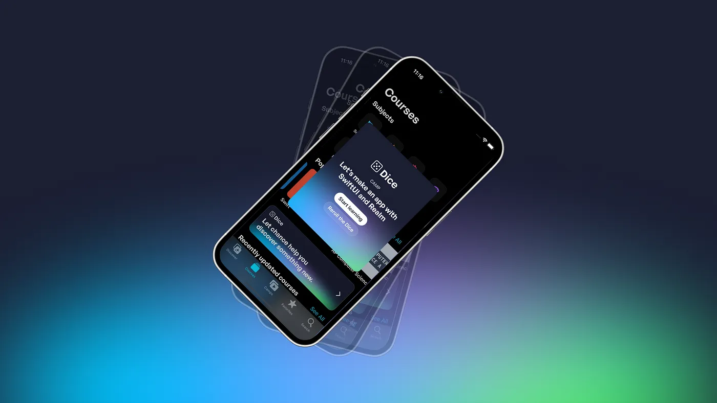
On STEMpump.org, we added a new experience called Dice. It's a simple content randomizer that finds you a camp or course and just redirects you into it. It's a fun thing with a few animations.
So with the app, when I thought we could do it, I had zero hesitation. Dice is now on the Courses tab, and you can click it, and it'll perform with the same functionality as the site. I also got to write a new cross-platform API for this functionality.
But here's where the fun part comes in: the randomizer will also work when you shake your device! Kind of like real dice. Just shake it, and it'll randomize!
PSA: Do not use your iPhone or iPad as a real dice!
Another fun thing I got to do was the Welcome Screen for new users. We've never done this before, so I wanted to do something unique.
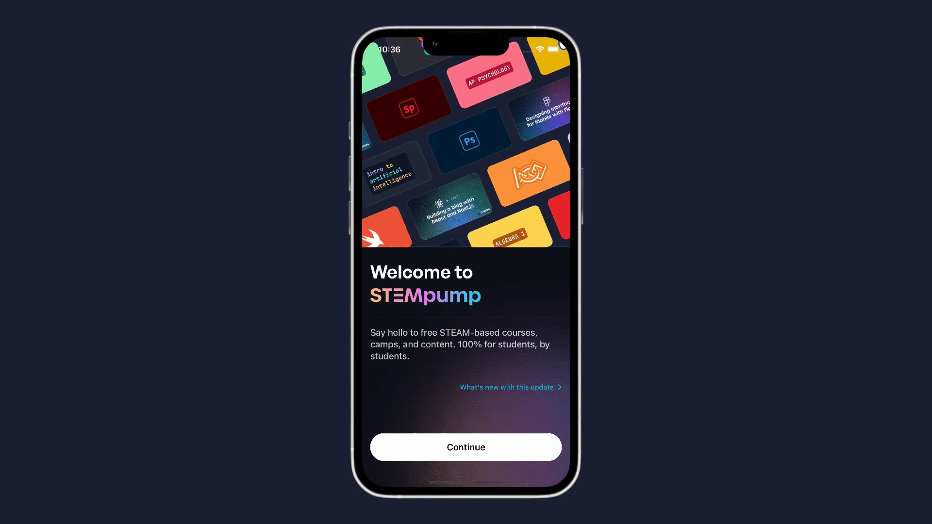
This new Welcome Screen displays a grid of our course and camp artwork infinitely scrolling, along with a few stylized gradients and text below. Creating the infinite art grid was interesting.
In Figma, I set up a frame with the grid inside, with the starting and ending tiles being the same. With a fantastic motion design tool called Jitter, we can take the frame from Figma and animate it. I lined up the starting and ending positions, exported the video, and added a view to display it.
And it turned out awesome! It's stylish, functional, and shows what STEMpump has to offer.
Tools of the Trade
As we wrap up this section, I thought I'd go over the tools I used for design. Whereas I used Adobe XD in the past, it was not as flexible as I'd like. Adobe programs haven't been something I've enjoyed using because of their strain on processing and terrible experience.
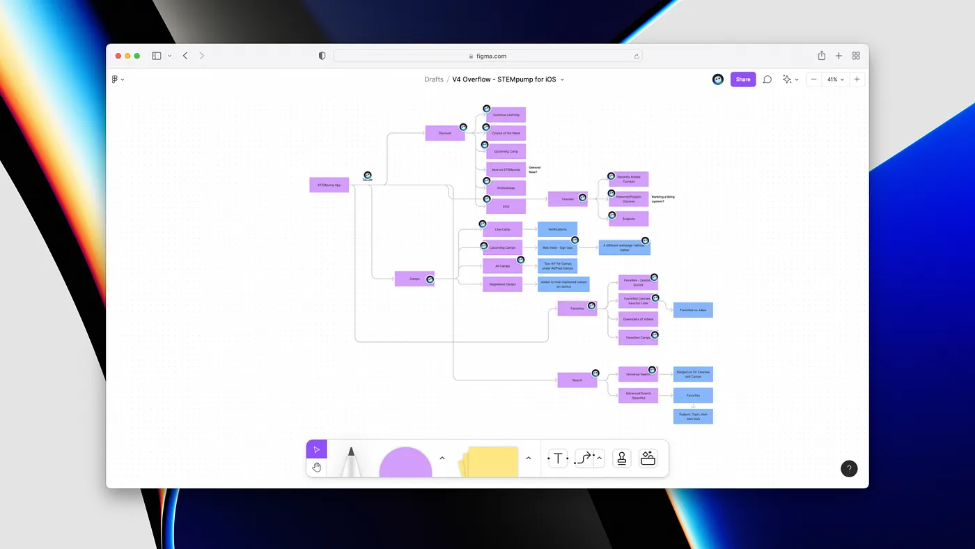
Figma has been my savior throughout this process — something we've used from Day 1 to Day ???. We used Figjam to plan out user flows, view organization, and how functionality and different networking pipelines would work.
Then we used Figma itself to plan out views themselves, create components of our mobile views, and experiment with different layouts and styles. Figma is becoming an all-in-one tool, and I'm all for it.
I could go on and on about design theory and superb design examples in our app, but this post would never end! Instead, I hope to write more often about design in the future, so keep on the lookout for that.
Development
Design is only one half of the story itself. How something is developed to complement the design or how the function influences the design (and vice-versa) matters.
The power of SwiftUI
As mentioned, we've written our app primarily in SwiftUI. We have a few UIKit extra functionalities, but for the most part, we're using SwiftUI.
And if anything, it's been a really good time building in it. For some functionality (like the Quizzes now in the app), I just rewrote our JSX in Swift, and the functionality just worked!
React and SwiftUI are pretty similar for handling components and views, making the jump back and forth pretty good.
We built this app for iOS 15, so it takes advantage of many built-in features and many of the features that matured since iOS14. For example, we're now using Lazy stacks for network data to better performance and efficiency and decrease device load.
We're now using AsyncImage for image displaying, the new Material backgrounds, asynchronous tasks, and @StateObject To name a few. The general trend is that Apple will ship more things from UIKit to SwiftUI every year, and I'm all for it — as long as they make it easier to work with iPad.
A whole new type of CMS: Sanity.io
During the summer JAMStack transition, finding a new content management and storage provider was a big goal. We had to make sure that content from STEMpump would load and update quickly, anywhere in the world. The worst thing a student can have is terrible load times.
We found Sanity.io, a unified content platform that powers experiences from companies such as Netlify, Nike, Sonos, Figma, and now, STEMpump. While most CMSs are designed for a singular platform, the web, Sanity.io, is appealing as a unified content platform: it works on various platforms.
However, they don't have a well-developed Swift counterpart yet, making it hard to request data. On top of that, they use their querying language: GROQ (Graph-Relational Object Queries)
I love GROQ. When I go back to GraphQL now and then, I wish it was written in GROQ. It's intuitive, helpful, and more precise than GraphQL. I can get the data I need, not the data I don't.
But like I said, there's no well-developed Swift counterpart — but they do have a query URL system, which is precisely what was needed to make our own. So we can write GROQ, then URL encode it, and request data from our Sanity.io CMS in our app. It's pretty simple, actually, but it gets the job done.
But also, what makes Sanity.io even more awesome (I know, right) is that it offers both Asset and API CDNs — giving us fast responses to requests that are cached. We use the Asset CDN for all files and graphics in the app but use the API CDN and the uncached API intermixed based on the functionality.
Some things use the API CDN to load in data fast, like lessons and courses. Other things, like the Camp Live Card or Dice, use the uncached API to load updates as soon as possible, making sure everything is fresh.
We're also developing our APIs to query our CDN, giving us continued extendability of our Sanity.io CMS for functionality that needs to be modified or altered. And with Sanity.io's Google Cloud Platform backend, we can take advantage of dozens of GCP, such as BigQuery, Cloud DNS, and the Kubernetes Engine.
The CDN Edge Network from Sanity.io powers all of STEMpump's experiences now and makes it easy for us to create new ones without any updates to the database. For example, not once did I need to update the CMS for the app, only when I wanted to add more fields and data.
Realm: Everything CoreData wished it was
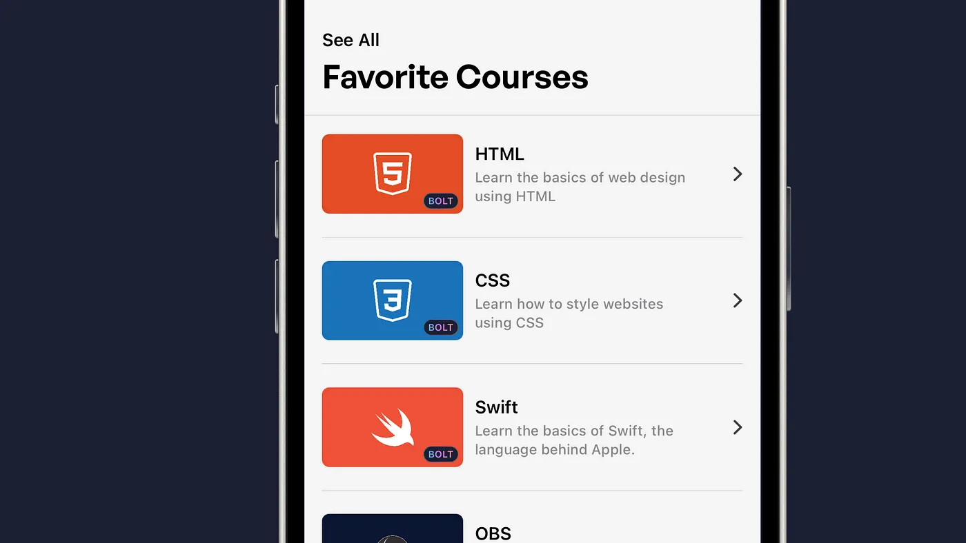
In the prior release, V3, we implemented a new feature called Favorites. You could favorite courses, filter them, and that's about it. It did its job, and that's the good part.
But it used Apple's CoreData, and in a single emoji, here's how I would describe it: 🤮
It's rough to work with, hard to expand and not suited for modern-day apps. Enter Realm.
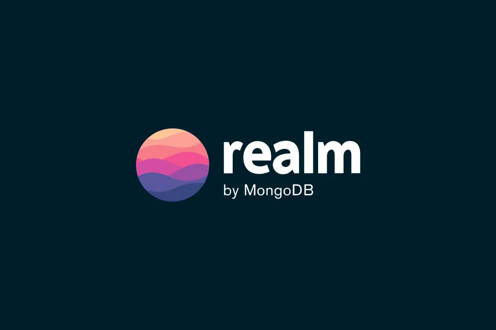
"Realm's mobile database is an open-source, developer-friendly alternative to CoreData and SQLite. Start in minutes, port your app in hours, and save yourself weeks of work." — they did not lie. It's made by MongoDB and has a remarkable Swift (and SwiftUI) implementation.
I was able to get Favoriting for courses done in under half an hour, and then Favorite Camps, Favorite Lessons, Continuity, and Registered Camps, done in the half-hour after. But, of course, all of this would've been a total slog with CoreData.
It's literally as easy as this.
import Foundation
import RealmSwiftclass SavedNote: Object, ObjectKeyIdentifiable {
 @Persisted(primaryKey: true) var id: ObjectId
 @Persisted var name: String
 @Persisted var content: String
 @Persisted var date: Date
 @Persisted var pinned: Bool
}
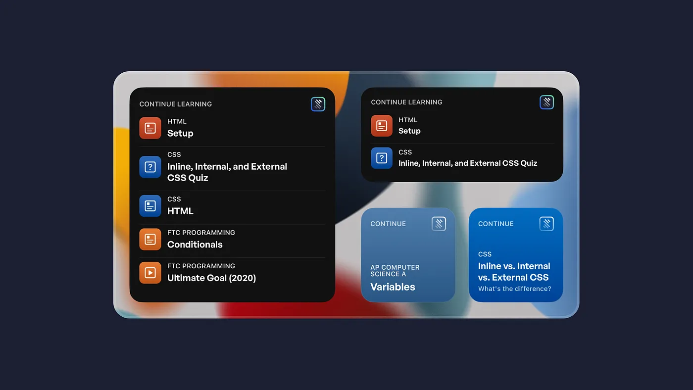
With Realm, we can develop one of my favorite features: Continuity, aka Continue Learning.
I originally had a feature similar to the previous version but ultimately had to scrap it due to functionality errors between CoreData and UserDefaults. That, and it only stored the most previous Course you viewed.
With Continuity in the all-new STEMpump, we're tracking the past ten lessons, projects, or quizzes you've visited. We may leave this at ten, increase it, decrease it, or give the user the option. Continuity works like a charm, rearranging orders in itself based on the most recent content you've viewed.
I was even able to extend its functionality, allowing students to jump straight into their last lesson, just from the course view — no need to search for it. But, unfortunately, it only exists for the items in Continuity, so if you looked at a course a while ago, it wouldn't show. We can extend this functionality, but it will require testing to see how large we can make the overall Realm array.
All in all, Realm is an excellent mobile database and offers some great functionality when it comes to creating classes, objects, and managers. I particularly loved @ObservedResults,as it gave everything I possibly wanted straight out of the box.
Realm is so great that I taught a camp on how to make a simple Notes app with Realm and SwiftUI.
How do we bridge the divide between web and native?
I think it's an excellent question to ask and something that many people take for granted. Most popular and great experiences have web and native counterparts, but are they complementary or supplementary?
We hope that the app is a supplementary experience to the website for mobile, but we can't forgo all of our content for the web either. We need to focus on both platforms equally and ensure they have feature parity.
We use Markdown, which is a web-based markup language. We use modified WebViews to display it, along with the system accessibility functionality built-in. Is this native or web? I'd argue it's a good mix of both, but problems still exist.
A few months ago, we received a lengthy review that highlighted many problems with the app's experience (Yes, we fixed every single one.)
One part stood out to me:
“The article with suggested courses does not have any links to those courses.”
At the time, I had no clue how we could fix this; We are displaying content in a WebView. We can send data, but receiving isn't that good. This is where the idea of STEMpump Bolt came.
Bolt is built on the same groundings of the Markdown parser I wrote but scans Markdown looking for STEMpump content. Right now, it only checks for courses, but I hope to expand its functionality. If it finds any content, it shows a suggestion to add it to your Favorites. In addition, it shows up in Lessons, Announcements, and Camps, which shows how easy it is to scale it across the app.
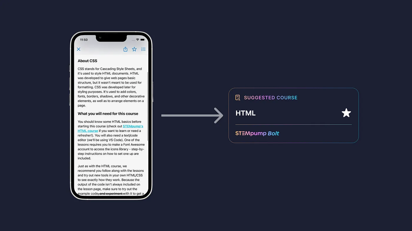
And in Favorites, Bolt-suggested courses are displayed with a special badge to differentiate content you favorited versus suggested content.
We were able to make sure we had feature parity by developing new, cross-platform APIs. These APIs control the Live Camp and Course of the Week data, Dice, Bolt, and how one registers for a camp.
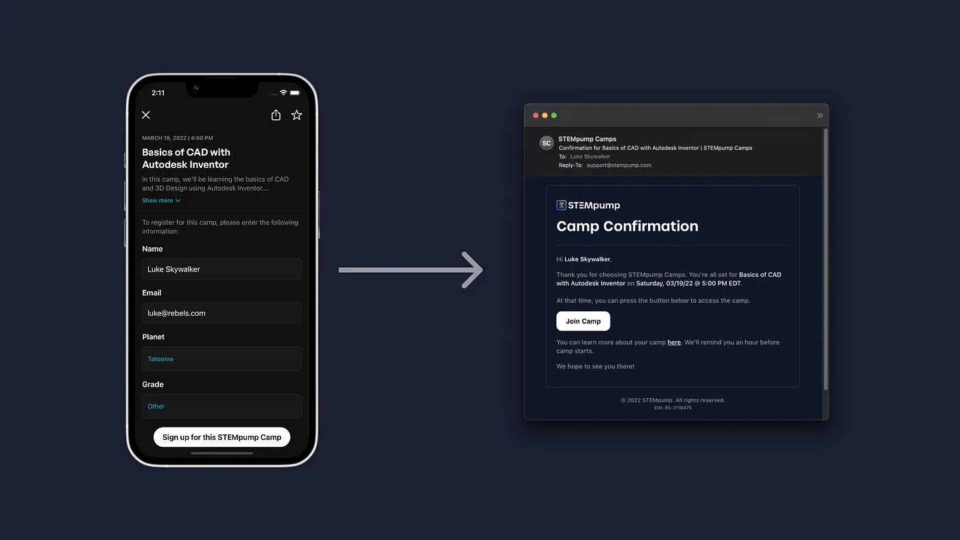
I wrote a new API that accepts a POST Request from the app then sent a few different API calls to Supabase, Mailgun, and Posthook. We use these services for STEMpump Camps, as it gives us the functionality we built over the Winter to create an incredible registration process.
Initially, the idea was to have a simple WebView that displayed a modified version of our camp registration; it became challenging, especially since we wanted to show the camps the user signed up for. This new API granted us the ability to save the camp to Realm and send data to a single source.
The end experience is excellent — just enter your info, boom, you're done. You'll get an email confirmation and a reminder 3 hours before your camp.
As time goes on, expect the gap between the web and native experiences to shrink to the point where either option is great to discover something new.
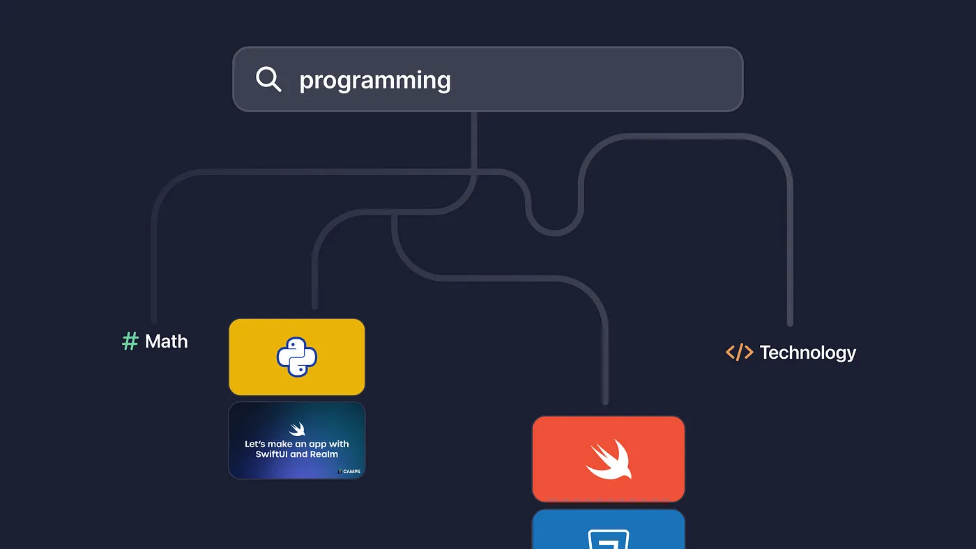
Search that's Human
We also adopted Algolia Search with our site update over the summer. Algolia is an excellent Search and Discovery platform, with features such as InstantSearch, Crawler, and Dynamic Synonym Suggestions, just to name a few.
We dubbed our implementation Universal Search, allowing you to search subjects, courses, or camps. It's highly performant and is the exact search you'll see on STEMpump.org.
The Swift/SwiftUI implementation is a bit hit or miss, but it's flexible to build out our search and use the underlying functionality.
It can correct your mistakes while searching and even takes advantage of our underlying topics system. In addition, Universal Search works in real-time, with NLP (Natural Language Processing) and Dynamic Synonyms being able to help out.
It's a Search system that's almost human, knowing what you want, even if you don't know exactly what you're looking for.
Building Guided Navigation
Do you know what sucks? Interruptions in learning.
You want an uninterrupted process, allowing you to continue learning and doing nothing else. For example, in prior versions, to go to the next lesson, you needed to back out of your current lesson, click on the next one, and so on.
And honestly, it was a pain. Felt more like a directory than a course. So we've provided new ways to traverse throughout a course in the latest version. For example, you can tap on the lesson list at the top right and choose lessons in the chapter or go to another chapter. Or, you can scroll down to the bottom of the page, where you'll have a card that allows you to continue.
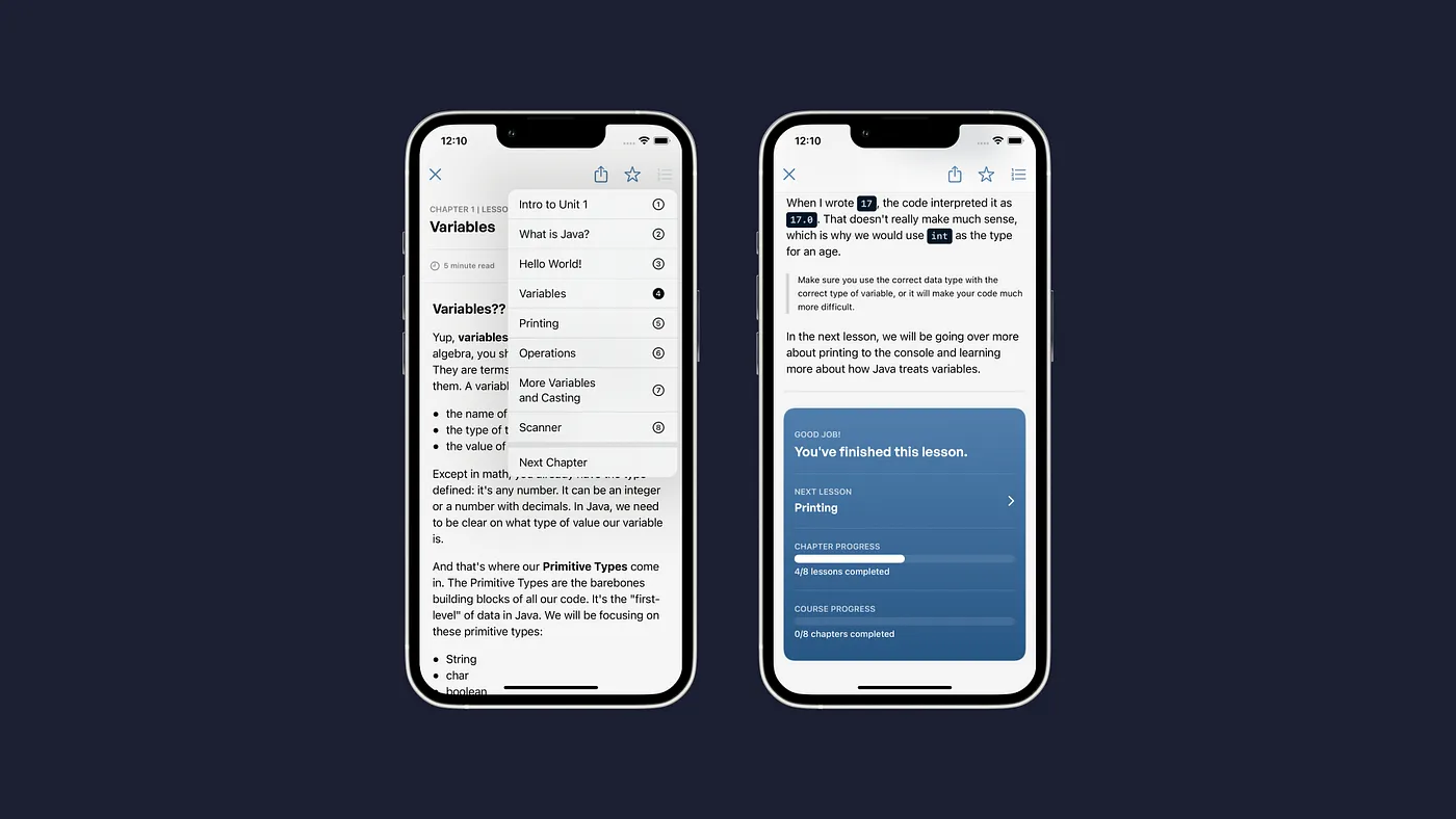
We've experimented with varying types of navigation (and will most likely continue to do so) to find a natural solution — providing the option to self-traverse or go lesson after lesson.
This eliminates any interruption when it comes to learning, letting you learn however you'd like.
There's so much more to talk about the development process of this app. It's the most extensive app I've worked on, and so many different factors contributed to the state of where it is today. Like design, I hope to write more often about development in the future.
Everything else
Back to your regularly scheduled update log, with a few more awesome things coming with this app update.
Camps
STEMpump Camps (formerly STEMpump Online) makes a comeback! After 1.5 years of not teaching in real-time, we're ready to get back into it and better than ever before.
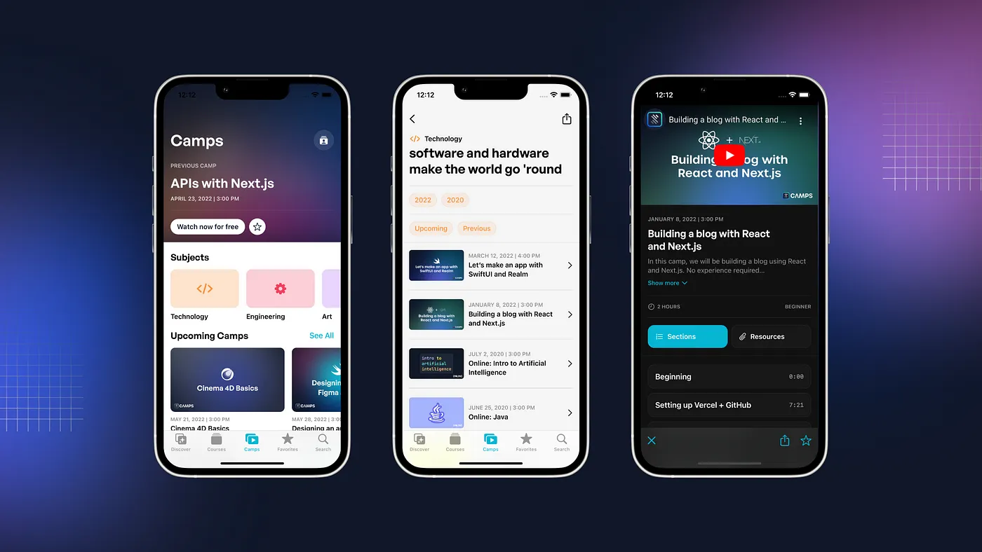
We've worked hard to refine every factor from STEMpump Online and make the experience fast, simple, and student-first.
You can register for upcoming camps, just like that. You can watch camps live and from the past. Everything has been rebuilt to provide an incredible experience.
Quizzes and Projects
Joining Lessons for the first time are Quizzes and Projects.
You can now take interactive quizzes with content directly tied to the course. In addition, there are multiple-choice and text-based questions, along with image and code-based questions.
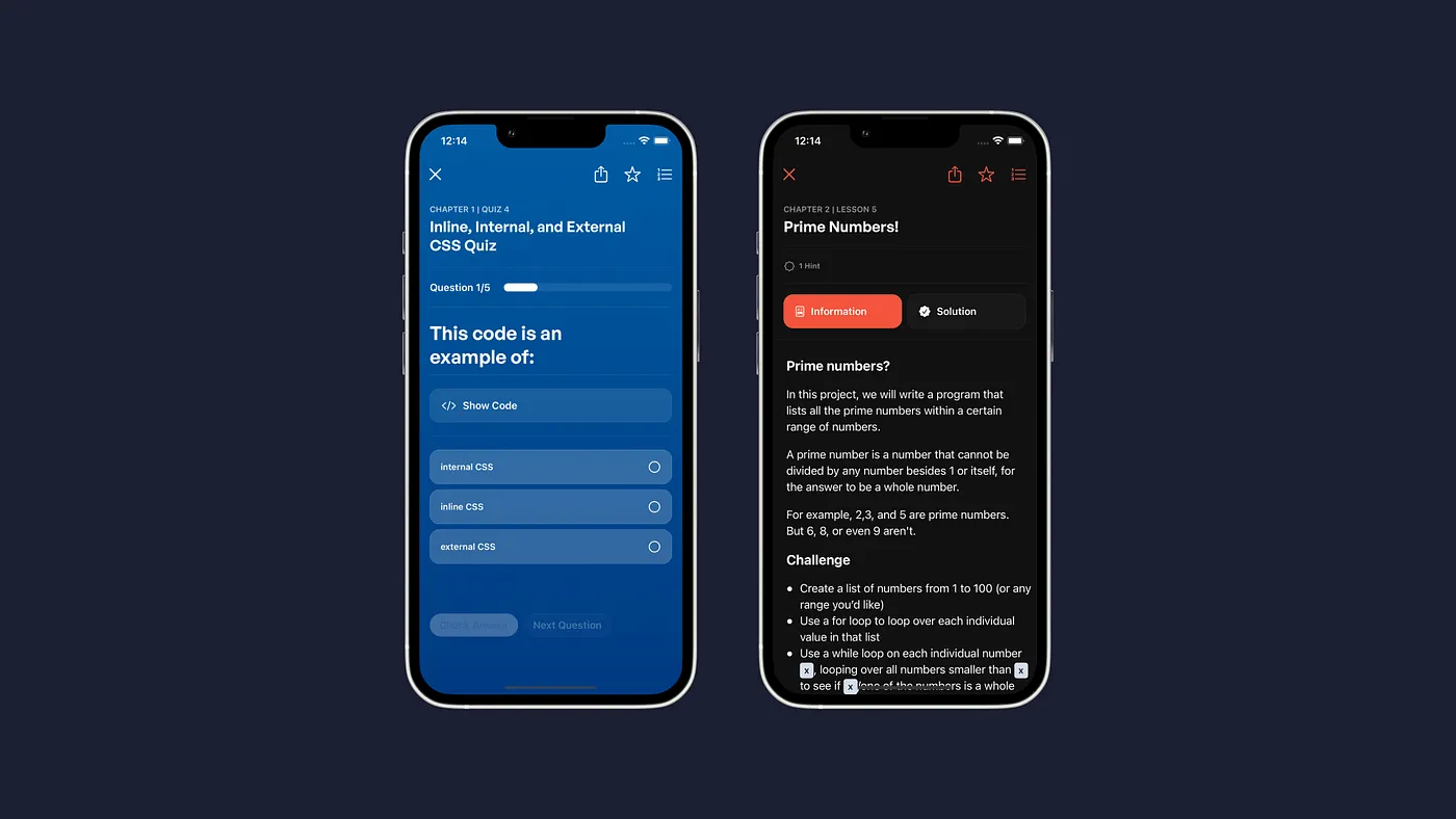
Fun Fact: Code in Quizzes are highlighted on-device, not on-server like Lessons and Projects.
Projects are open exercises that allow you to apply course content directly. Follow the instructions and complete the project. There are a few hints if you get stuck. When you're done, check the solution to see if you're right!
Updates to Courses
Courses have been redesigned to provide more context than before. They are now arranged by Chapters for more accessible organization. Learn about Course status, content, and more extended summaries. In addition, new Learning Time functionality has been added to Courses, Camps, and Lessons.
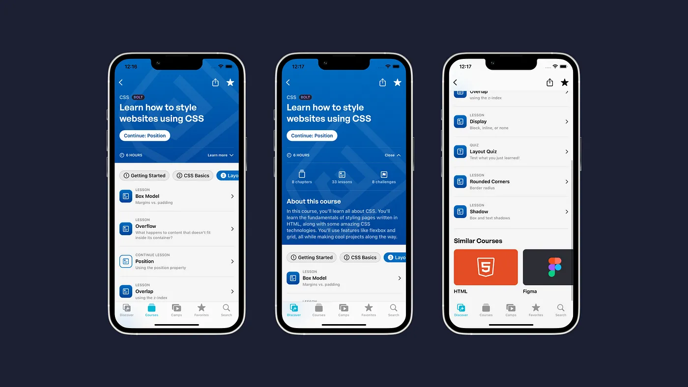
Some courses have similar courses shown below them if you want to find anything similar.
Preferences
You can now change your app icon to all-new and redesigned versions of the STEMpump icon! In addition, you can delete all data stored on your device in a single click, or you can choose what to keep and what to delete.
The Wishlist
I decided to go back to that original post years ago and see what I wanted from the app at the time.
- Information about how long each course takes
- Sharing the entire course with others
- Offline Courses
- Potential for using Adobe Fonts (?)
- User System for personal growth
- More interactivity
- More Subjects
- Less "Non-Styling"
I think I solved all of these problems, in a way. The new app provides times on almost everything that one can read. You can hit the share button and share practically anything.
Offline Courses is interesting — I think with the current system, we might not be able to do that with whole courses, but maybe individualized lessons (and camp downloads 😉)
Adobe Fonts is a no-no. However, we do have a user system of sorts. There's a lot more interactivity and a few more subjects. We're using a lot of custom elements, too.
But I also remembered a draft post with a different wishlist:
- More web-specific features to the app create a cohesive STEMpump experience
- Support iPadOS
- Widgets?
- Transition to using Markdown and smarter JSON objects
- Look into creating a YouTube player
And yeah, these all have been completed, except the Widgets part — which is in the works.
3/18/22 UPDATE: Widgets just got done 😶
And it was a pain. But that’s a story for a different time.
4/29/22 UPDATE: Burnt out! 😣
I got so burnt out from working on the app that I uh… never finished or submitted it. (Creative burnout is real and I definitely struggle with it)
But this past week (with the fear of AP exams on the rise), I got everything else done, and more!
- Updated Announcements
- V3 to V4 Transfer Tool for Favorites
- Offline “Mode” (really just a complainer)
- Remote Updating
- Better refresh cycles
- Lesson/Quiz/Project of the day
- New design for Discover and Camps
- In-App Events
- Camp Countdown Timer
Also, another story for another time! Back to your regularly scheduled essay.
Conclusion
This was a long post. If you read all ~20 minutes of it, thank you. It really means a lot.
The all-new STEMpump App is probably the biggest thing I've done (besides STEMpump.org) and the most complicated app I've built. Nevertheless, I'm incredibly proud of it and excited to see where it goes.
It represents my journey and maturity in design and development, and I couldn't be happier with it. But who knows, a year from now, I'll probably be bashing this design 😜
If you like my work and want to continue to support it and STEMpump, please consider donating. Any amount makes a difference in our mission to provide free STEAM education.
You can download the app for yourself here. I would appreciate any feedback you can offer. Like always, if you want to chat or have questions, feel free to shoot me a message.